21s Novice Spanish
What do seismograms look like at increasing distances from epicenter?
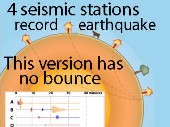
A companion animation titled "Four-station Seismograph Network Records a Single Earthquake" showed the buildings and cows bouncing and rolling above the surface of the Earth. The intent was to illustrate the nature of wave movement, not mimic reality. This version has no bounce. The cow is just for fun and to emphasize that seismic waves traveling away from an earthquake occur everywhere, not just at seismic stations. A person would feel a large earthquake only at station A near the epicenter. Stations B, C, D, and the cow are too far from the earthquake to feel the seismic waves. Both the scale of the buildings (and cow) and the amplitude of the movements are exaggerated. The cartoonish amplified ground motions show the compressive (up-down in this case) P wave, the shearing (back-forth) S wave, and the rolling surface wave motions recorded by sensitive instruments. Notice that Station D does not record an S wave because shear waves cannot travel through Earth's liquid outer core.
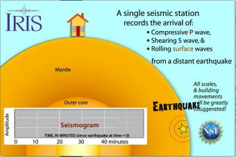
Seismic waves travel through the earth to a single seismic station. Scale and movement of the seismic station are greatly exaggerated to depict the relative motion recorded by the seismogram as P, S, and surface waves arrive.
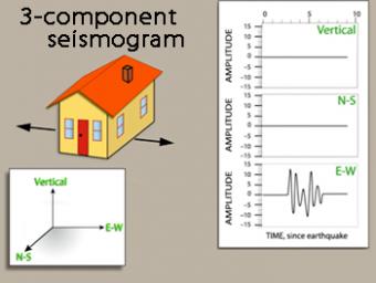
We use exaggerated motion of a building (seismic station) to show how the ground moves during an earthquake, and why it is important to measure seismic waves using 3 components: vertical, N-S, and E-W. Before showing an actual distant earthquake, we break down the three axes of movement to clarify the 3 seismograms.
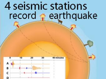
A cow and a tree in this narrated cartoon for fun and to emphasize that seismic waves traveling away from an earthquake occur everywhere, not just at seismic stations A, B, C, and D. A person would feel a large earthquake only at station A near the epicenter. Stations B, C, D, and the cow are too far from the earthquake to feel the seismic waves though sensitive equipment records their arrival.
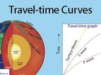
A travel time curve is a graph of the time that it takes for seismic waves to travel from the epicenter of an earthquake to the hundreds of seismograph stations around the world. The arrival times of P, S, and surface waves are shown to be predictable. This animates an IRIS poster linked with the animation.