This page contains background information on the visualizations and seismology. A full list of all animations can be found here.
To save any of the visualizations on this page to your computer, right click the links labeled "Download Quicktime File" and choose Save Linked File.
As earthquake waves radiate out from the epicenter and encounter Earth's surface, they cause the ground to move. Unless the earthquake is nearby, the scale of these motions are too small and occur over too long of a time scale for humans to detect. However, sensitive instruments such as seismographs are able to discern such changes and record them as seismograms. Dr. Charles Ammon, a professor at Penn State University, has developed a novel way to visualize the seismograms recorded from a large number of seismic stations called an array. These visualizations display the change in amplitude of the ground at each station of the nearly 400 earthquake recording stations through time. Because Transportable Array seismometers are distributed in a grid with unprecedented density, the collective display of the ground motion at each seismometer is particularly informative. In this collective display, or visualization, of the data we see clearly how seismic energy sweeps across the array.
 The following tutorial uses specially designed visualizations combined with explanatory text to scale-up your understanding of the data being presented to you in visualizations. The ultimate goal of this process is to instill the underpinning concepts necessary to allow you to explore this type of data product on your own. The tutorial progressively steps you through three different constructions of these visualizations in increasing complexity: Double Window, Triple Window, Global Window and Double Wheatfield. Concepts are built-up in this tutorial (both conceptually and visually) and should be digested in ascending order. Further, we recommend that for each step in the tutorial you: a) watch each visualization; b) read the textual description and associated figures; c) re-watch the visualization noting the features described in the text; d) repeat as necessary.
This visualization introduces you to single seismic station and the data it recorded. Its has been created because its simplistic nature allows you the viewer time to focus on the core concepts of this visualization series.
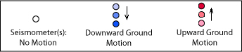
The station circle changes color depending on whether the motion (as shown by the amplitude of the seismogram) is going up or down. In this visualization, blue is downwards motion, red is upwards. More intense colors indicate larger motions.
This visualization shows the same station and seismogram as in the visualization above, but now adds in all the other seismic stations (aka "siblings") that make up the array. Now the patterns of propagating seismic waves are revealed. What previously looked like random red & blue blinking dot on the map is now part of a coherent, large-scale pattern.
The Solomon Islands earthquake occurred on April 1, 2007, at 20:39:58 (Universal Time), with a magnitude of 8.1. The latitude and longitude of the earthquake were: 8.5 degrees South and, 157.0 degrees East, and the earthquake was 24 km deep.
This animation has been created to further illustrate the meaning the circle color (alternating back and forth from red to blue) of each station. The animation begins with a map view as before, but then rotates the map so that you are seeing it from the side (as if you are sitting out over the Pacific Ocean and seeing California from the edge). In the edge view one can see each station now represented as a spheres, moving up and down and changing colors as they do so. Watch one station in the cross section closely. What happens to its color as it reaches the peak of its motion? And at its lowest position?
Once the view rotates back into "map" or "top" view you are still seeing the same spheres as before, and they are still changing color. However, now the stations are again seen from directly overhead. As a result they simply look like circles with their vertical motion again being show as colors. (note: this animation used a different color convention: blue=up, red=down)
These visualizations consist of three panels, each conveying a different "views" of the same information. While the volume of visual information presented can be initially overwhelming, once understood, this format allows you to simultaneously consume different perspectives. Two examples of this type of
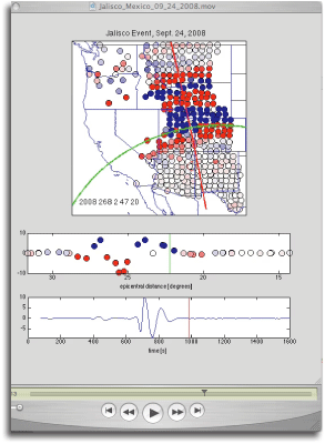
This visualization shows a distance profile for the earthquake that occurred in Sichuan, China on May 12, 2008, at 06:28:01.5 (Universal Time), with a magnitude of 7.9. The latitude and longitude of the earthquake were: 31.00 degrees North, 103.32 degrees East, and the earthquake was 19 km deep.
This visualization shows an azimuth profile for the earthquake that occurred in the Mariana Islands, on September 28, 2007, at 13:38:58.4 (Universal Time), with a magnitude of 7.4. The latitude and longitude of the earthquake were: 21.98 degrees North, 142.68 degrees East, and the earthquake was 261 km deep. Note that the stations shown in the middle panel should all move up and down in unison - but they don't always do this, since the inside of the Earth is not perfectly uniform.
These "big picture" animations attempt to tell the whole story, highlighting the travel of seismic waves from the time of the earthquake until they arrive in the United States and are recorded by the USArray's Transportable Array. This visualization is constructed similar to the Three Window described in Tutorial #4 above but uses first a global and then a map view in the upper most window. These visualizations open with a view of the globe focused on the origin of the earthquake. Here you see the propagation of the "P" or "primary" wave, indicated by a green circle, the "S" or "secondary" wave, indicated by the red circle, and the surface waves, indicated by the yellow circle. The waves travel out in every direction from the earthquake (as the circles show). This is notable as the first energy to arrive at the Transportable Array are the waves that follow the shortest path - the "minor-arc" of the great circle that connects the earthquake to the seismic array (e.g., across Alaska, in the case of the China earthquake). However, the waves also reach the array by traveling the long way around the planet - thus later in the animation one sees the surfaces waves arriving from the opposite direction as the original waves (and the yellow surface wave indicator circle shows this).
Download Quicktime File (Low-Res 13MB - Hi-Res 36MB)
This series of visualizations is designed to show the three-dimensional motion of the ground at a seismic station. Like the tutorials above, circles in these visualizations represent seismic stations and the color of the circles indicate vertical ground motion. In addition to vertical motion, horizontal displacement of the ground at the station is added through the use of "tails" on the circles. The tails point in the direction of the horizontal motion, with the length of the tail indicating the amplitude of the motion (though the length of the tails is clipped if they are too long). The horizontal motions shown by the "tails" in these visualizations are strongly reminiscent of waves of wind sweeping across a wheat field.
Visualizing the three dimensional motion of P, S, and surface waves shows that the ground motion for P waves is parallel to the direction of wave propagation while for S waves and some surface waves the particle motion is perpendicular to the wave propagation.
The paired animations allow a comparison between predicted arrival times to these stations from a distant earthquake vs. the actual observed behavior of the stations. Thus, the left side is actual data, the right side are predictions based on the PREM Earth model. How does the model compare? What does it get right? What doesn't seem to fit? Why?
Download Quicktime File (Low-Res 9MB - Hi-Res 32MB)